How to use the new Next.js Image Component in your MDX Blog
Published on November 16, 2020
Update Summer 2021
Vercel has now released released Next.js 11 which once again brings improvements to image optimization. So manually specifying the image size is no longer necessary, as long as the image is directly imported:
import Image from 'next/image';
import picture from '/profile-picture.jpg';

export default function Home() {
  return <Image src={picture} alt="Profile Picture" />;
}
So, as long as your MDX engine supports importing React components in MDX files, all you need to do to benefit from image optimization is this:
import Image from "next/image";
import picture from "/profile-picture.jpg";

# Title
Some Markdown

<Image src={picture} alt="Profile Picture" />
Introduction
In October Vercel released Next.js 10 which includes a component for automatic image optimization. This component decreases loading times by using a couple of smart techniques, like dynamically serving the image in the size it gets rendered at or lazy-loading images.
Vercel advertises the next/image component as a drop-in replacement for the HTML <img> element.
<img src="/profile-picture.jpg" width="400" height="400" alt="Profile Picture">
Gets replaced with
import Image from 'next/image'

<Image src="/profile-picture.jpg" width="400" height="400" alt="Profile Picture">
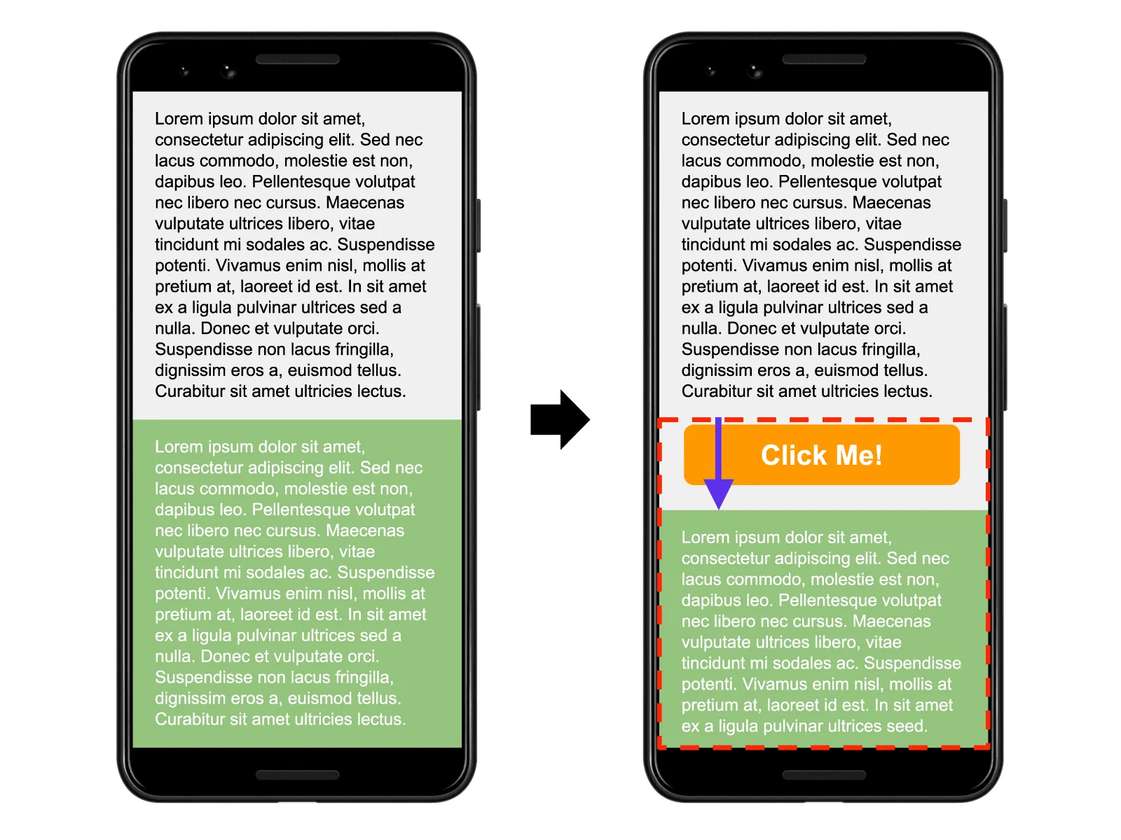
next/image requires the developer to specify a width and height for the image to avoid Cumulative Layout Shift. When you don’t specify with and height attributes on an image the browser won’t know how much space the image will take up until the image has loaded. This causes the content below the image to change position because space is needed to display the loaded image.

Status quo
The articles on my blog are written in MDX and Next.js Static Site Generation (SSG) renders them at build time. Webpack’s file-loader makes it possible to have images in the directory of that specific article and import them like any regular file. They then get moved into the public Next.js folder at build-time and the public URL gets returned with the import statement.
// Import image like any source code file
import progressBar from './progress-bar.png';
// progressBar -> /static/media/progress-bar.b95cd6c9d38c5d8c614c8946d1c36baf.png

// Usage
<img src={progressBar} alt="Progress bar without any labelling" />;
The MDXProvider from @mdx-js/react then maps all <img> elements in MDX files to the <Image> component form Chakra UI to apply some styling.
import { Image } from '@chakra-ui/core';

const components = {
  img: (props) => <Image rounded="lg" {...props} />,
};

export default components;
My Webpack config for file-loader looks as follows:
config.module.rules.push({
  test: /\.(png|jpe?g|gif|mp4)$/i,
  use: [
    {
      loader: 'file-loader',
      options: {
        publicPath: '/_next',
        name: 'static/media/[name].[hash].[ext]',
      },
    },
  ],
});
Migrating to next/image
Since next/image works as a drop-in replacement, all I’d need to do is change the <img> elements in every MDX file the next/image component and add width and height props. But this would mean manually editing every single MDX file and determining the resolution of every single image. So instead I decided to find a way to do this automatically. Since Next.js blogs use static site generation you can easily run a script at build time which detects the resolution of any image.
Since I was already using file-loader I decided to modify it a little bit to be able to run some custom code for every imported image, so I can detect its resolution. The return value of this callback method can be accessed through the import statement in the React code. I published this modified version of file-loader on NPM under the name enhanced-file-loader.
This is my updated Next.js config where I call a function from the image-size package to determine the width and height of my images.
const sizeOf = require('image-size');

config.module.rules.push({
  test: /\.(png|jpe?g|gif)$/i,
  use: [
    {
      loader: 'enhanced-file-loader',
      options: {
        publicPath: '/_next',
        name: 'static/media/[name].[hash].[ext]',
        generateMetadata: (path) => {
          return sizeOf(path);
        },
      },
    },
  ],
});
I decided to tweak my MDX files a little bit for simplicity’s sake. However, this is optional since you could theoretically route everything through the src prop on the <img>.
// Import image like any source code file
import progressBar from './progress-bar.png';
// progressBar:
// { url: "/static/media/progress-bar.HASH.png", metadata: { width: 1000, height: 5000 } }

// Usage
<img {...progressBar} alt="Progress bar without any labelling" />;
And finally, in the file where I map tags from MDX to React components, I can use the next/image component.
import { Image } from '@chakra-ui/core';

const components = {
  img: (props) => <NextImage width={props.metadata.width} height={props.metadata.height} {...props} />,
};

export default components;
Conclusion
This is everything I did to add Image Optimization to my Next.js blog. It makes it possible to add new images with zero additional effort while still enjoying the benefits of this new Next.js feature. However, this is simply how I chose to implement this. I am fairly new to both Next.js and customizing Webpack, so take my advice with a grain of salt. There might very well be a way better way to do this. Be sure to let me know if you found another (perhaps better) way to do this.